Data visualizations of Covid-19 can be misleading.
Much of the data about the coronavirus pandemic is flawed. Collected and reported in different ways by different countries, it almost certainly undercounts the number of cases and deaths from this disease.
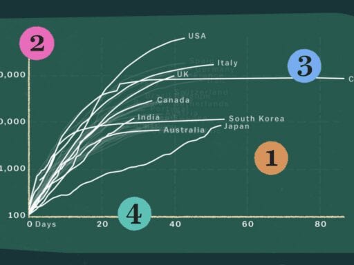
But organizations and journalists still need to report the available data to inform the public and help guide policymakers. Much of that data ends up in visualizations, like charts and maps, which can make it easier to understand and analyze. But it’s important to know how the process of data visualization can shape our perception of the crisis.
In this video, we deconstruct one particularly popular chart of Covid-19 cases, first published by the Grattan Institute and the Financial Times, and explain how to avoid being misled by it.
You can find this video and all of Vox’s videos on YouTube, including our coverage of coronavirus. And if you’re interested in supporting our video journalism, you can become a member of the Vox Video Lab on YouTube.
Author: Joss Fong
Read More