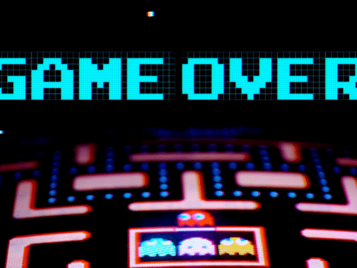
This simple typeface took over the arcade.
Arcade games from the 1970s through the 1990s look pretty archaic now; their chunky and primitive visuals have been replaced by hyper-realistic worlds. But a deeper look at arcade-game design reveals the artistry and ingenuity it took to make full-fledged characters out of just a few pixels. Even more challenging was encoding legible and playful typography into those worlds to guide players through the game.
These fonts weren’t often designed by trained typographers in computer design programs — this was years before Photoshop. Instead, they were designed by hand on graph paper and coded into the game pixel by pixel.
The result was a mix of some good ideas and some really bad ones, but one typeface stood above the rest. It’s called often called the “Atari” font, or the “Namco” font in Japan, and it lasted until larger resolutions and 3D gaming became the norm. It’s a shining example of how video game designers used an 8-by-8 grid to communicate to players.
In the book Arcade Game Typography, type designer Toshi Omagari breaks down the evolution, design, and history of arcade-game fonts. In the video above, he guides us through this delightful 8-bit world and breaks it down pixel by pixel.
You can find this video and all of Vox’s videos on YouTube. And if you’re interested in supporting our video journalism, you can become a member of the Vox Video Lab on YouTube.
Author: Estelle Caswell
Read More