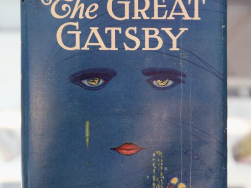
As Fitzgerald’s classic enters the public domain, 3 cover designers face the “nerve-wracking” struggle of redesigning its jacket.
As 2021 kicks off, publishers with an eye for the high school English syllabus market are celebrating: The Great Gatsby is now in the public domain.
Suddenly detached from pesky copyright concerns, new editions of F. Scott Fitzgerald’s classic novel are going to print at multiple publishers. But the opportunity to re-release Gatsby brings with it a new challenge: figuring out how to package a book whose original cover has become iconic.
“Everybody knows the original with the spooky eyes,” says Greil Marcus, the author of Under the Red White and Blue: Patriotism, Disenchantment and the Stubborn Myth of the Great Gatsby. Francis Cugat’s guache 1925 cover, with its enormous eyes peering out of a deep blue sky, weeping a line of green down over a red mouth and a glittering fairground, is one of the most instantaneously recognizable book covers ever created. In part, that’s because it so precisely evokes the same sense of Jazz Age decadence that Fitzgerald’s novel conjures. “There’s a suggestion of money and luxury,” says Marcus. “There’s a sense of opulence, not really so much freedom as indulgence.”
The Cugat painting is not the only cover The Great Gatsby has ever had. It’s gone through other iterations — many of them, Marcus notes, involving cocktail glasses, perhaps in an attempt to get at the sense of opulence the original cover creates. But since Cugat’s cover was revived for the 1979 paperback reissue, it’s become the image that first comes to mind when most people think of Gatsby. And none of the publishers of the new Gatsby editions can use it.
So instead, they’ve gone dark and minimalist.
/cdn.vox-cdn.com/uploads/chorus_asset/file/22250486/headshots_1611252751660.jpg) Left, center: Penguin Classics. Right: Modern Library.
Left, center: Penguin Classics. Right: Modern Library.The new Modern Library edition of The Great Gatsby features a ’20s car emerging from the darkness, its headlights peering out of the cover like the eyes of Dr. T.J. Eckleburg. On Penguin Classics’ mass-market cover, a stylized illustration of Gatsby turns his head away from us so that we can’t see his face, only the brim of his hat. And on Penguin Classics’ trade paper edition, there are no figures at all: just the title, with the fully rendered letters stretching and toppling between Art Deco frames.
Coming up with a new approach was a “nerve-wracking” experience, says Nathan Burton, who designed the Penguin Classics mass-market cover.
“The original design is one of the most iconic and recognizable book covers of all time,” says Chris Brand, the VP and creative director at Random House who oversaw the new Modern Library cover. “It almost felt like a shame to change it at first.”
Brand says he briefly considered trying to recreate the original Cugat painting for Modern Library, perhaps by hiring a contemporary artist to reinterpret it for the 21st century. But the publisher, he says, wanted something a bit darker.
“He liked the idea of depicting the run-down Valley of Ashes instead of the glitz and glam that you’d normally associate with Gatsby,” Brand says, referring to the impoverished slum Fitzgerald describes about halfway between glitzy Manhattan and wealthy West Egg. “We ended up with a cover that does a little of both, where the car signals the period and a visual that’s widely associated with Gatsby, but with typography that feels contemporary and a little gritty.”
In contrast, Burton says he hit on the concept for his cover, with Gatsby turning his face away from the viewer, almost immediately. He made a series of thumbnail sketches of Gatsby as he read, trying to settle on the right placement. “I just wanted to have him on the cover somewhere, but have him not front-on,” Burton says. “I wanted to play with the angles and shadows.”
His guidelines from the publisher, he says, were minimal. “The brief I got was that they wanted it to have mass appeal to high school students and adults,” he says. “And also they wanted to sell it at a low price point, so there were things I couldn’t do [that would increase printing costs], like use [metallic] foils. It was nice that the cover had to stand on its own.”
Burton was designing a mass-market cover, which is traditionally the cheapest edition of a book and often intended for classroom use. But the other Penguin Classics edition is a trade paperback, which supports a higher price point — and in this case, fancy French flaps. (French flaps are an extension of the cover of a paperback that folds over into the interior of the book, like the jacket flaps on a hardcover. They’re expensive!) So for this edition, cover designer Mario De Meyer wanted to create a concept that would work not just for the front cover space, but across the spine, rear cover, and onto the flaps as well. That’s why he turned to typography.
“I treated it as one big design where the cover is only a small part of the total design,” De Meyer says. “This gave me room to do some illustrations, tell a bit about the story, and give it some mystery and exuberance.”
/cdn.vox-cdn.com/uploads/chorus_asset/file/22258723/GreatGatsby_Trade.jpg) Cover: Mario De Meyer. Creative director: Paul Buckley
Cover: Mario De Meyer. Creative director: Paul BuckleyAre any of these new covers likely to become as iconic as the Cugat original? That remains to be seen. But the way each one tries to play with different elements of the book speaks, says Marcus, to part of what has given Gatsby such staying power.
“None of the characters are so completely filled in that there isn’t room for the reader to imagine what they look like, how they act,” Marcus says. “We put ourselves into this book. And artist after artist has said, ‘Well, I think this is what it looks like.’”
Author: Constance Grady
Read More


