Why the internet is overflowing with Friends merch — officially licensed and otherwise.
Last week, I saw it on a teenage girl’s T-shirt in my neighborhood in Brooklyn. A few days later, a European tourist in Midtown Manhattan. Earlier this summer, I’d seen versions a handful of times in other parts of New York City and in California too, and my editor reported seeing it as far away as Ireland, on a backpack at the Cliffs of Moher, all in the same unmistakable yet slightly unreadable kerning: the Friends font.
Precisely 25 years after its 1994 premiere, Friends is enjoying a renaissance. A great deal of it, of course, is thanks to Netflix, where viewers who were too young to understand its jokes when the show first aired are rediscovering what made it so popular then. It’s responsible for more than 4 percent of the streaming service’s total views, second only to The Office. The Office is enjoying its own moment in the cultural spotlight, but Friends has something it doesn’t: a very memorable logo.
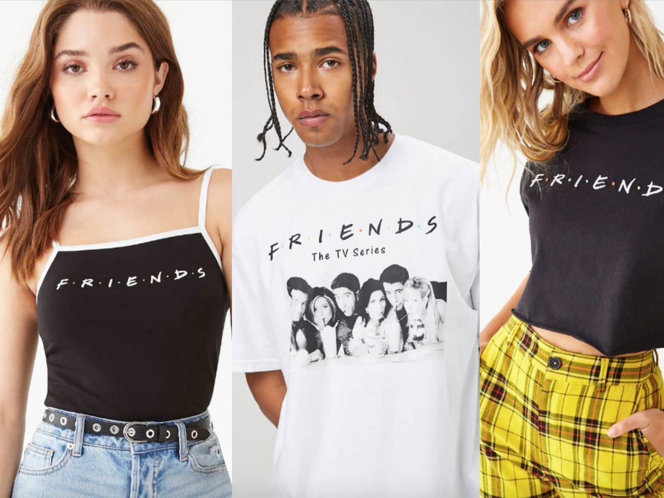
High school graduates are ordering versions on hoodies that say “Seniors” in the Friends font. Brides are giving T-shirts with “I Do Crew” in the uppercase, handwritten white letters separated by multicolored dots to their bridesmaids. Etsy, Amazon, and hundreds of anonymous screen-printing operations offer their own versions, creating a thriving — and unlicensed — black market of merch for one of the most popular TV shows of all time. And people are buying in.
/cdn.vox-cdn.com/uploads/chorus_asset/file/19266888/il_794xN.1882564553_fglo.jpg) Etsy
EtsyConsidering its iconic status, the Friends logo was designed surprisingly haphazardly. Theories on what the dots between each letter in F-R-I-E-N-D-S signify abound on the internet: some believe they mean “FRIENDS” is actually an acronym, (for what, no one knows), others think that each dot represents a character, or that because the color of the dots match the colors of the umbrellas the cast holds in the title sequence, that there is some kind of message to be found.
The truth is that the dots mean nothing. Executive producer Kevin S. Bright once told Comedy Central that they’re “just a design element” and that they were only used because “it made it stick out.” In fact, not a whole lot of consideration went into choosing the logo for the TV show that is almost synonymous with an entire decade: Bright said that the logo, designed by a woman named Deborah Naysee, was “the first and only pass at a logo. We just loved it right away.” (I couldn’t find a graphic designer named Deborah Naysee anywhere on the internet; Deborah, if you’re reading this, tell us what the dots mean!)
The handwritten, all-caps, italicized typography though, tells us about the show itself. Handwriting analyst Elaine Charal said that the sans serif suggests that “the people on Friends are more direct and less conservative that the average person” and that the “doughy” look to parts of the letters nod to “the more sensual aspects of the show.”
Alexander Tochilovsky, typography expert and design curator of the Herb Lubalin Study Center, similarly says that the handwritten aesthetic makes the logo feel friendly, and that many comedy shows use a slant or an italic to indicate humor.
But that’s not why the Friends logo is everywhere. There are much better television show logos that exist (Cheers! Stranger Things!) but the Friends logo’s resurgence is surely related to the fact that Friends is cool now. And not just cool in the way that Succession or The Walking Dead is cool, in that lots of people watch it and talk about it online, because wearing a shirt with the logo of either of those two shows would be lame. No, the Friends logo is cool in the way that the Rolling Stones logo was cool in the mid-2000s, when it was on every single T-shirt at Macy’s. Friends is retro; so is its logo.
“I can’t think of anything typographic that says ‘1994’ better than loosely spaced brush caps separated by primary colored dots,” says Stephen Coles, curator at the Letterform Archive in San Francisco. He thinks that another reason that the Friends logo might be so popular at the moment is because it’s a total pendulum swing against the fonts typical in corporate branding in the 2010s. “As geometric, mechanical sans serifs grow in popularity within tech and corporate branding, interest in the handmade is steadily rising,” he says. In short, the Friends logo looks cool now because it doesn’t look like the boring, focus-grouped fonts we typically see in our day to day lives.
The Friendsaissance has made it so that it’s difficult to walk into a standard mall store and avoid T-shirts with the logo of the 25-year-old TV show. Old Navy, Hot Topic, Forever 21, Pac Sun, and Target all currently sell licensed and trademarked Friends clothing designed for their target audience: You can find a T-shirt at Old Navy, a spaghetti strap tank at Forever 21, and a shirt that says “How You Doin’?” at Hot Topic.
/cdn.vox-cdn.com/uploads/chorus_asset/file/19266937/il_fullxfull.1828604262_32kl.jpg) Etsy
EtsyThat’s part of it. But the other reason the Friends logo is everywhere is it’s very easy to put the Friends logo on stuff. Even though the original logo was almost certainly designed by hand, a man named Gabriel Weiss has since turned his own take on the letters into a font that can be downloaded by anyone for zero dollars and used in perpetuity, at least for personal use.
Etsy sellers and T-shirt screen printers have, predictably, made ample use of it; a cursory search will reveal Friends font wall decals, makeup pouches, Starbucks cups, and lots and lots of bridal party gifts: You could present your friends with customizable “Best Man” socks in the Friends font or force them to wear a shirt that says “The One Where Rachel Gets Married” in the Friends font, or you yourself could wear a thong with “Bride” on the front in the Friends font, or bikini underwear with the word “Bride” on the butt in the Friends font. Realtors can purchase T-shirts that say “Realtor: I’ll Be There For You” in the Friends font. Texans, for no discernable reason, could buy shirts that say “Texas” in the font of a show wherein Texas barely exists.
Considering how much of it remains for sale, it seems as though Warner Brothers has not seriously targeted small-time sellers of unlicensed merch. And because fonts are not copyrightable in the US, the products that say “Bride” in the Friends font likely qualify as satirical or derivative works, and are therefore fair use. Tochilovsky says, however, that if a seller downloads Weiss’s Friends font and essentially recreates the actual Friends logo on a shirt, however, Warner Brothers would likely have grounds to claim infringement.
But for now, it’s never been a better time to buy and sell Friends merch, officially licensed or otherwise. Whether that will continue once Friends leaves Netflix in 2020 is unclear, but in the meantime, the Friends logo will, as they say, be there for you.
Sign up for The Goods’ newsletter. Twice a week, we’ll send you the best Goods stories exploring what we buy, why we buy it, and why it matters.
Author: Rebecca Jennings
Read More