The typefaces on highway signs, deconstructed.
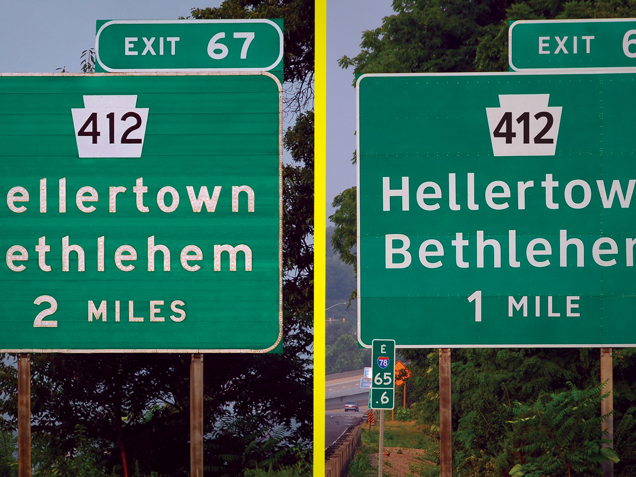
When you head out on the highway in the United States, you’re probably paying attention to the signs above your car and on the side of the road — the ones that direct you to your destination. If you’re looking for an exit or a rest stop, chances are you’ll see the typeface Highway Gothic. It became the highway standard in the 1950s, born out of an initiative from the California Department of Transportation to develop a clearer and more flexible standard for highway signs.
But for the past decade, a new typeface has been trying to take its place: Clearview. This new typeface boasts wider spaces inside of letters and less chunky letterforms, and tries to solve some of Highway Gothic’s readability issues. Learn more in the video above.
You can find this video and all of Vox’s videos on YouTube. And if you’re interested in supporting our video journalism, you can become a member of the Vox Video Lab on YouTube.
Author: Antonella Crescimbeni
Read More